CONGRATULATIONS FIRST QUARTER 2026 WINNERS!
THANK YOU TO ALL WHO ENTERED.
Judging Statement and Award Comments
Casey Klahn, PSA
The Established artworks as a whole were enjoyable and fulfilling to see. Certainly it is a skilled set of artists who contribute to the Dakota online contest! I enjoyed the Emerging artists expressing themselves individually in many different ways using pastels. It is an expansive medium and only limited by the artist's imagination.
Casey Klahn, PSA
Dakota 1st Quarter 2026 Competition Judge
|
| |
ESTABLISHED ARTIST WINNERS
|
| |
 |
 |
 |
 |
 |
 |
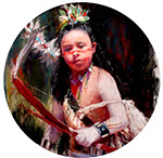
FIRST PLACE
Nori Thorne
Young Hopi Dancer |
SECOND PLACE
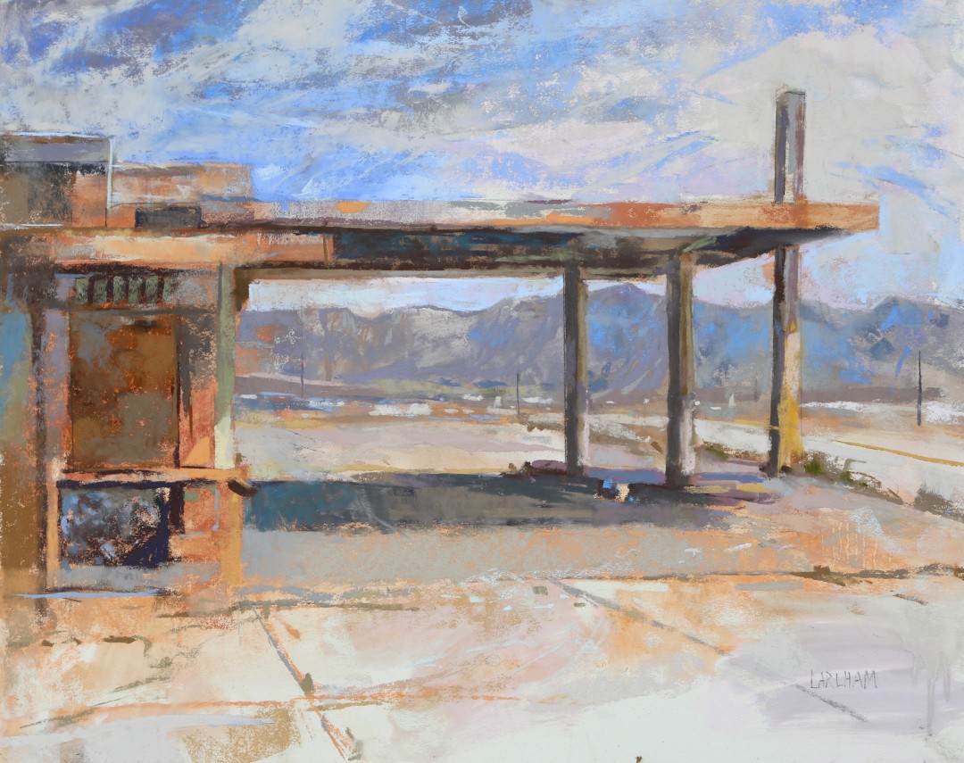
Margaret Larlham
Time Warp |
THIRD PLACE
Nancy Ness
Blossom's Heart |
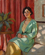
FOURTH PLACE
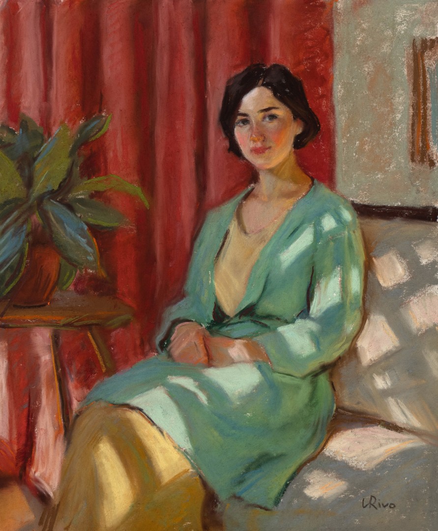
Lena Rivo
Portrait with Red Drapery
|
Honorable Mention
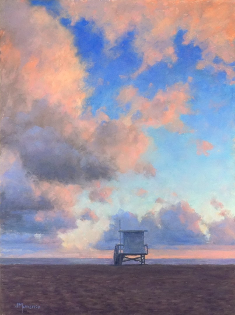
Joseph Mancuso
Evening Sky |
Honorable Mention
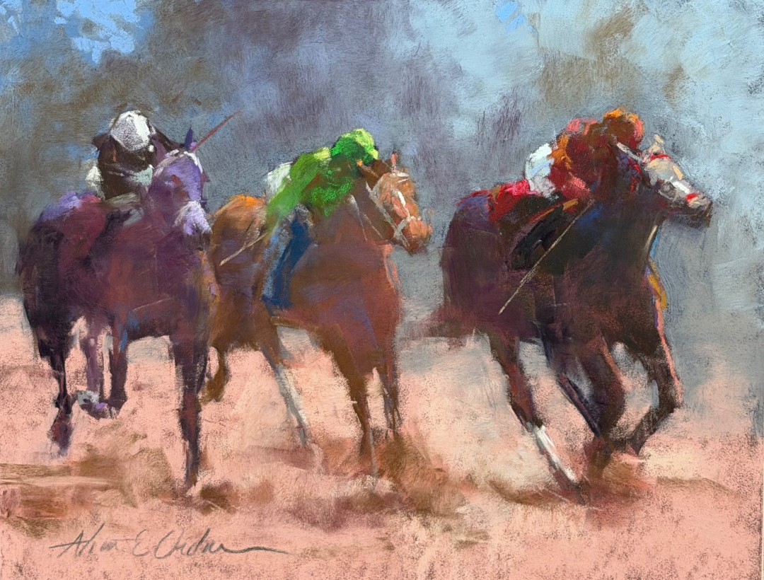
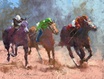
Aline Ordman
Racing at Keenland |
| |
|
|
|
|
|
 |
 |
 |
 |
 |
 |
Honorable Mention
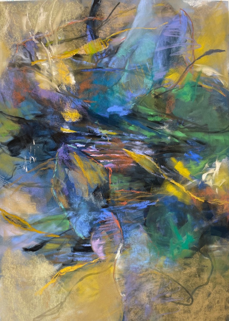
Debora Stewart
Shifting Currents |
Honorable Mention
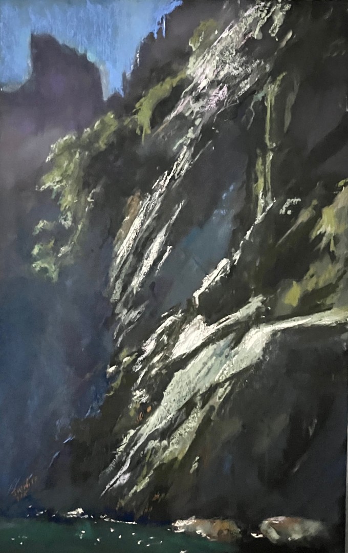
Jane Wright Wolf
Racing Light Milford Sound |
Honorable Mention
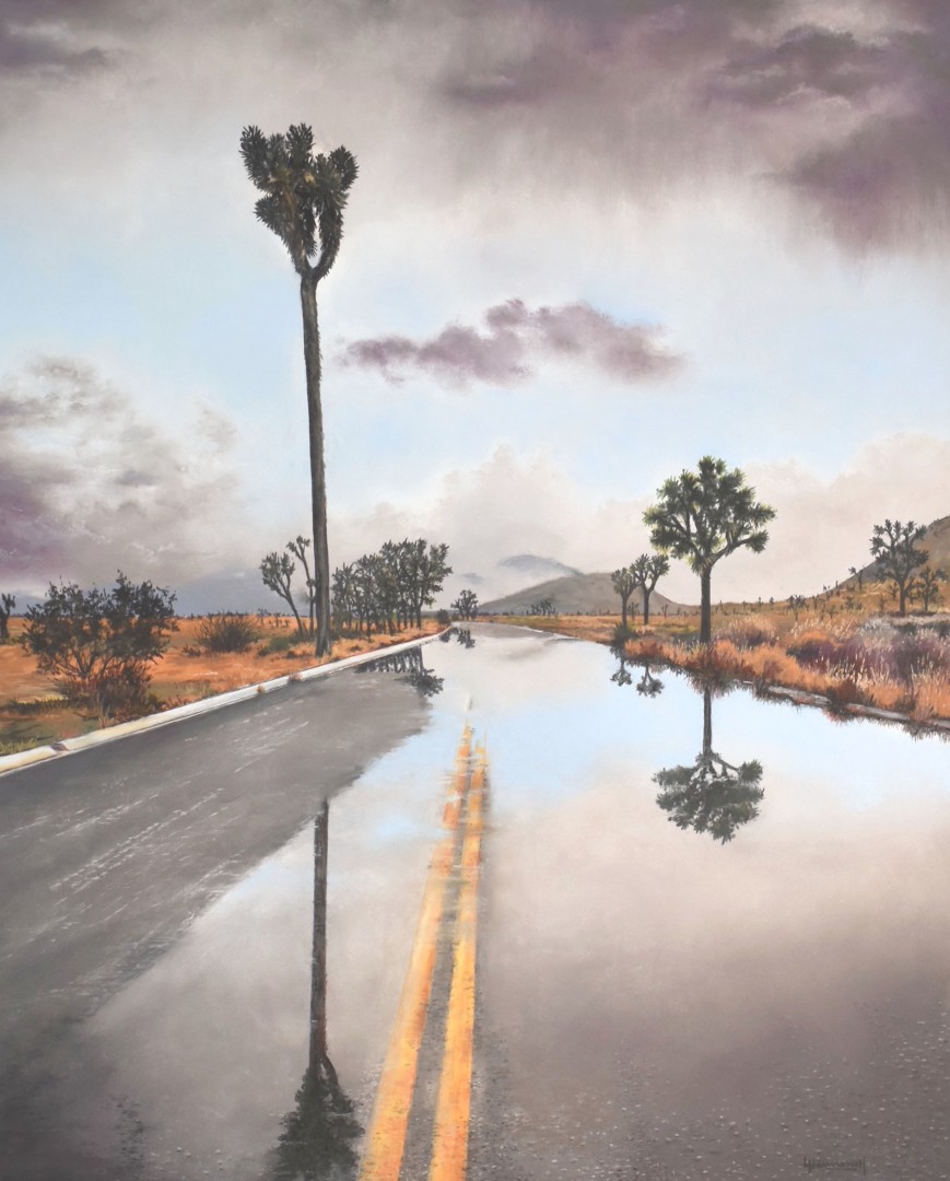
Larry Hemmerich
Joshua Tree Reflection |
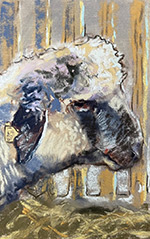
Honorable Mention
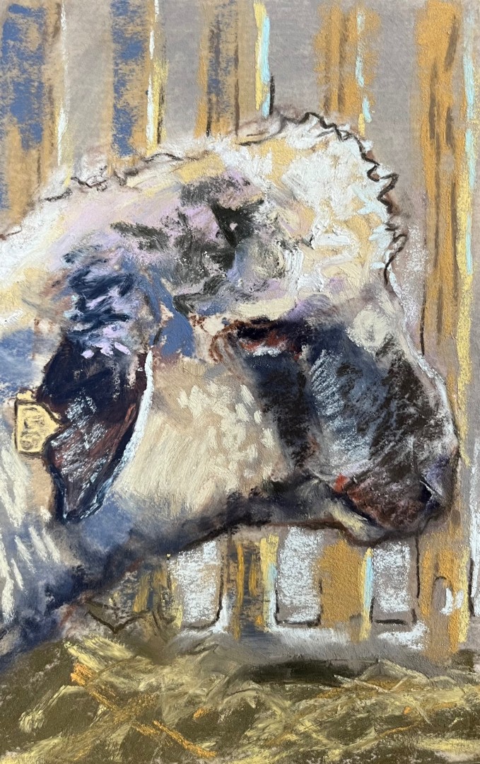
Mary Beth Drabiszczak
Side Sheep |
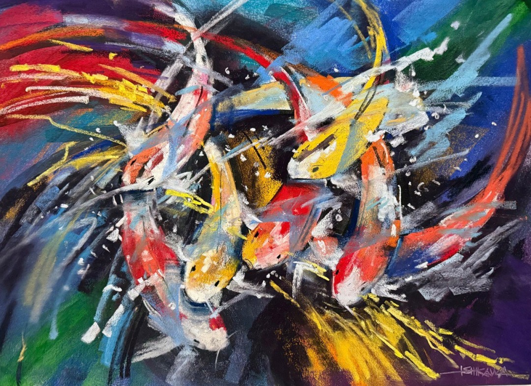
Honorable Mention
Mike Ishikawa
Flashing Kois |
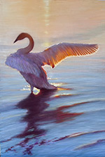
Honorable Mention
Margaret Ferraro
Swan at Dawn |
| |
|
|
|
|
|
|
ESTABLISHED WINNERS
1st PLACE
Young Hopi Dancer
The archer boy with a floral headdress is powerful in design and presents him with a brilliant splash of color. The use of a round crop is so unusual that it works to really focus you on the subject. It is a bold device! The artist has mastery of the medium and the form of the subject is strongly depicted, with both gestural movement and solidity. The bent arm holds him in stasis and is a foil for the movement of the head and torso, and the objects he holds. I can't say enough about the design and could write a chapter on it. Look at how his head is a third of the space, giving us an asymmetric beginning and then you look and see more dynamic balance like this. The diagonals! They create a fulcrum for all of his movements. You can go to school on this painting and it is well worth your time to study, and to enjoy.
2nd PLACE
Time Warp
So deceptively simple, but designed or composed with mastery. Think of the mass, and light, and surfaces. The textures bid you to place your hand on the walls and overhang. I want to take out my toolbelt and start repairing the abandoned gas station! But, it's done with very few marks and colors and tones. Simplicity is that state when a painting has nothing else to subtract. I love simplicity! No painting ever failed for being too simple. It's a powerful and dynamic work and at the same time unassuming. Refreshing. Courageous.
3rd PLACE
Blossom's Heart
This pastel easily wins with color and design. That white space that supports and agrees with the yellow flower is a masterful move. A lesser artist would want to give the yellow flower a contrasting background, but this artist gives you the abstract space of white and flower in a type of analogy, and the beautiful contrasts on either side. Don't forget that natural contrasting purple beard right in the center. Cad Red, Cobalt Blue and perhaps a Hansa Yellow have the force of pure colors that are real and natural.
4th PLACE
Portrait with Red Drapery
This artist knows the intense colors reside in the half light of shadow. On display in this figure work are a completed and attractive background, and there is little doubt that the colors are carrying the design. Nothing is superfluous here: everything contributes to the appeal. The choice of hues and their placement and their proportion are all organized with intention, and this concert of elements pleases the eye tremendously. I enjoy the note of dark hair and how her head orients us as we begin to explore the whole painting.
|
|
CLICK HERE TO VIEW ALL ENTRIES
EMERGING ARTIST WINNERS
|
| |
|
|
|
|
|
 |
 |
 |
 |
 |
 |
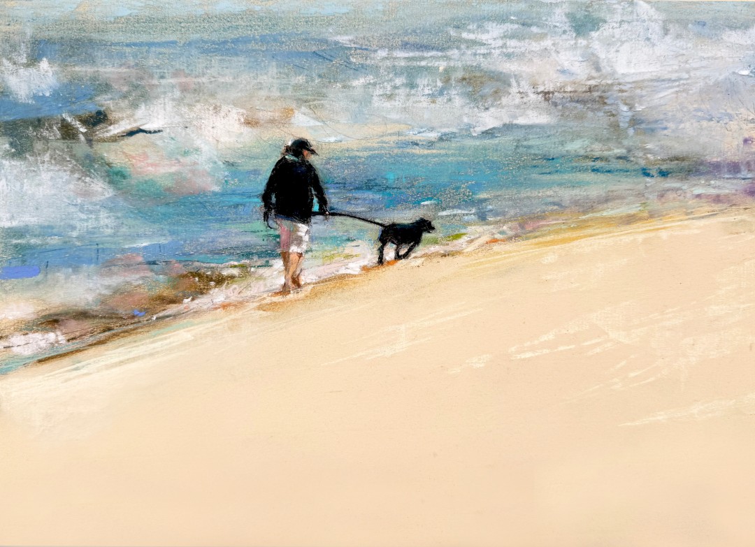
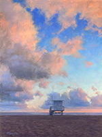
FIRST PLACE
Cindy Wojdyla
Gwen |
SECOND PLACE
Gabriela Goette
Rhine Delta |
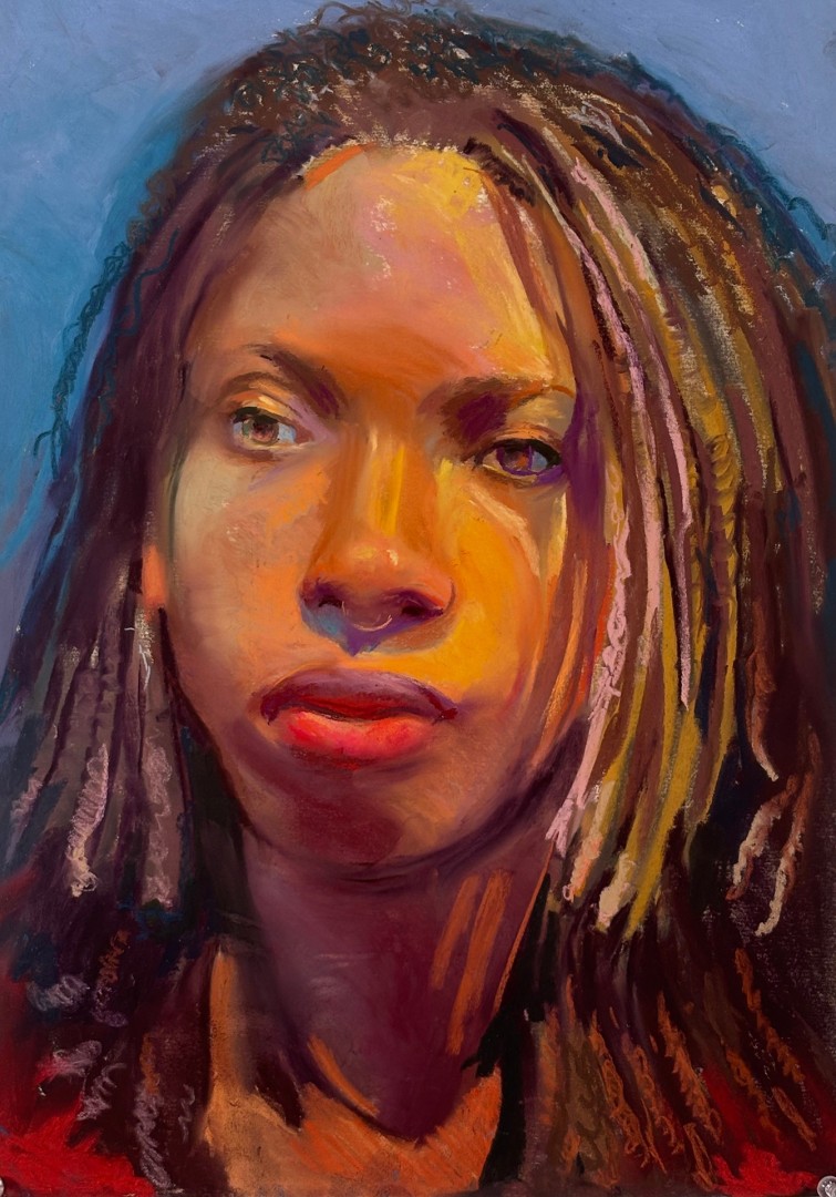
THIRD PLACE
Christine Wendel-Farrugia
Grace |
FOURTH PLACE
Karen Springer
Peaceful Church Interior |
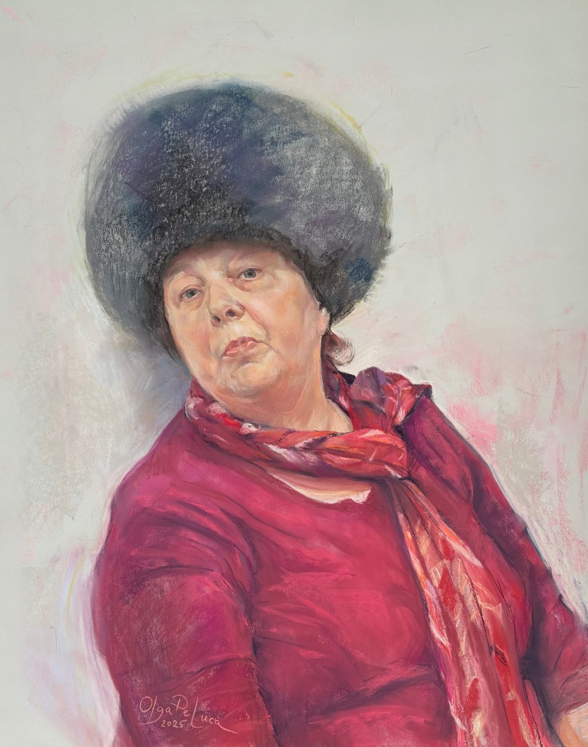
Honorable Mention
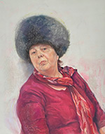
Olga DeLuca
Woman in the Siberian Hat |
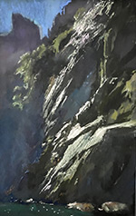
Honorable Mention
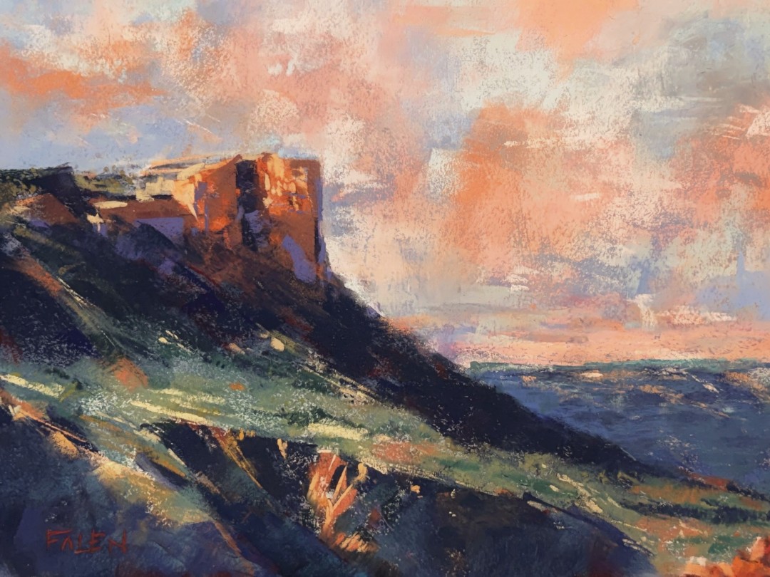
Steve Falen
Above the Colorado |
| |
|
|
|
|
|
 |
 |
 |
 |
 |
 |
Honorable Mention
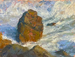
Lily Hurlimann
Lonesome Rock |
Honorable Mention
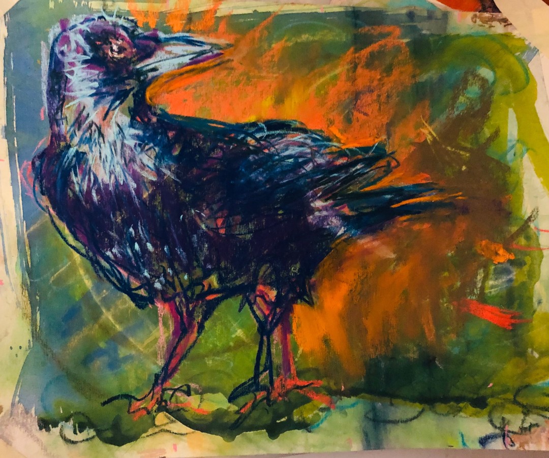
Janice Johnson
Crazy Crow |
Honorable Mention
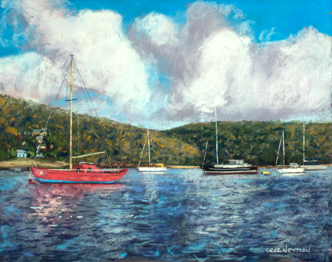
Cruz Newman
Sailing Day in the Caribbean |
Honorable Mention
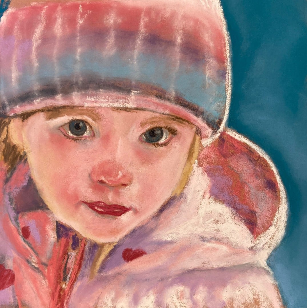
Sharon Mikkelson
Child It's Cold! |
Honorable Mention
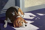
Suzy Quader
Bailey in the Sun |
Honorable Mention
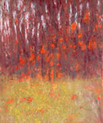
Patricia Sorenson
Autumn Blaze |
|
EMERGING WINNERS
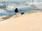
1st PLACE
Gwen
A walk on the beach with your dog takes me away in mind to just that place and activity. The world's cares go away, and the pup pulls against his leash and just wants to go! I've been writing about Simplicity, and there is also the element of Brevity. Brevity is using the least means necessary to render your painting. Ocean surf is nice and nothing if not action, mood, and marks that suggest water and waves. Water in the air and also meeting the beach: a small dash of blue and burnt umber and some greens or olive colors. Some near white grays, and big portions of space: the sandy beach and the ocean in a diagonal rising through the picture. You can certainly feel this pastel, and the whole point is the simplicity of the experience. You can add and add and add details and content to a painting, but chances are you're killing it. Follow this artist's example where simple completes the form, and it's the best painting.
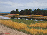
2nd PLACE
Rhine Delta
Here's a solid landscape and it explains the genre in and of itself (which is an abstract thing, isn't it? I call it the big-F Form of the painting). Laid out in a horizontal crop, we have the content of road and forest and water and distance and sky. Rendered with skill and clarity, and the artist is in control of the values and colors. But, it isn't any one thing that makes the grade, it is the whole. It is everything working like a team to express the water and land just so.
3rd PLACE
Grace
Sketch Atlanta Study I really enjoy the strong form in this head portrait. The subject occupies the picture space and has life. Her rendering using tones or values is quite strong, and the marks of analogous skin tones or colors show me her surface planes. The artist allows for loose rendering and not some perfection of finish. That loose work adds energy and interest that the viewer feels. Some various ochres, reds and blues, and some Mars Violet colors in variety, create the portrait. The intensities are varied and managed. These colors make a stable image and they serve the close-up viewpoint we're given.
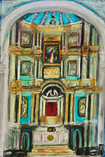
4th PLACE
Peaceful Church Interior
I really dig this pastel! You know, there was a time when art was a projection top to bottom, and not deep to shallow. The perspective was hierarchical, not "natural". Not only does the artist give us this Gothic subject, but he or she makes the space descend from the vertical. The domed ceiling and arch organize the interior and, although I don't know if this is representing a sacred space, or perhaps a theatrical space, it does give me an idea of this space organized by its own rules. Big F-Form is the parts playing the correct tune. It is not the projection of depth in space. This artist got that down pat!
|
DAKOTA STAFF PICK
Dakota has the unique privilege of supporting artists in their artistic journey every day. The Staff Pick is an Emerging artist who has made strong choices in design, color, and composition, and is taking great strides in their use of the pastel material. This quarter we congratulate Sigridh Kiersch - keep painting!
|
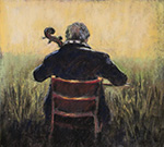
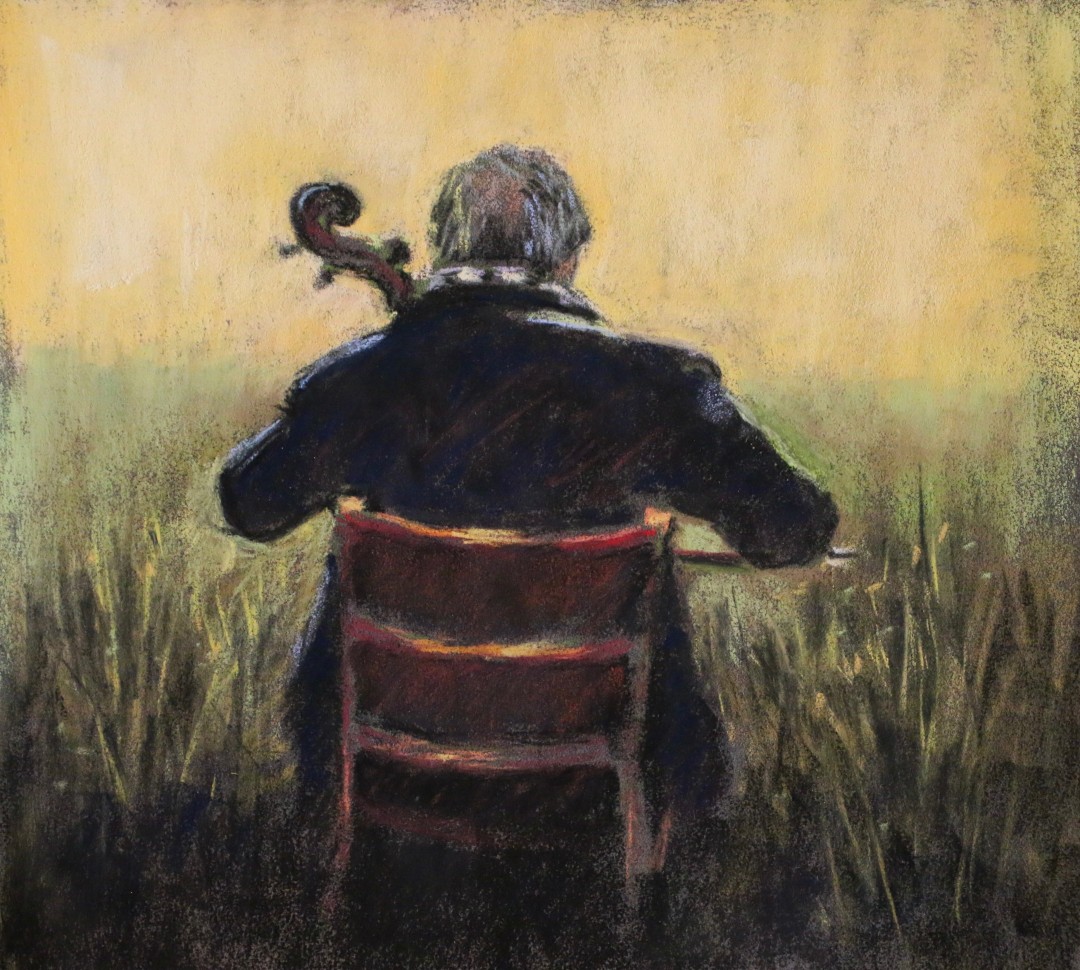
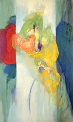
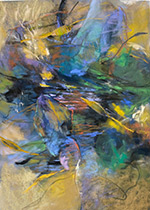
WINNER
Sigridh Kiersch
'Awash in a Field of Sound' |
|
|
|
|
|
CLICK HERE TO VIEW ALL ENTRIES
|
| |
|
|
|
|
|